
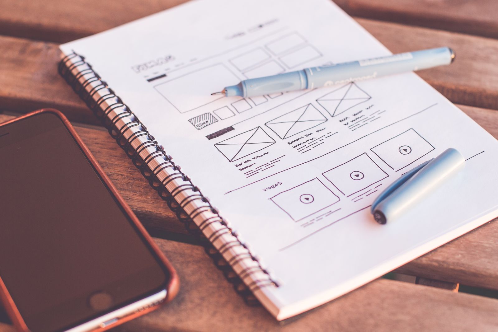
A landing page converts when the first screen answers what you sell, who it's for and what to do next, the headline repeats the ad's promise, proof is specific and verifiable, the form asks for the minimum, and the page loads fast on a mid-range phone. Score yours against the 9-element table below.

Landing Pages That Convert: Anatomy of a Page That Sells
You paid for the click. Google Ads, a Meta campaign, a WhatsApp broadcast, whatever got the visitor there. Now they’re on your page, and within a few seconds they’ll decide whether you get an enquiry or a bounce.
We audit landing pages for Hyderabad businesses every month, and the pattern is boringly consistent. Pages that convert share the same skeleton. Pages that don’t are missing the same bones.
So here’s the full anatomy, top to bottom. Open your own landing page in another tab and score it as you go.
The first screen has 3 questions to answer
Before anyone scrolls, the visible screen must answer: what is this, is it for me, and what do I do next.
If a stranger can’t answer all 3 in 5 seconds, the page leaks. Run the test on someone who’s never seen the page. Watch their face.
The other half of this is message match. If your ad promises “interior design packages within your budget” and the page opens with “Welcome to Sharma Associates, established 2009,” the visitor feels the bait and switch and hits back. The headline should repeat the promise that earned the click. This is also why sending Google Ads traffic to a generic homepage burns money: the homepage was written for everyone, and the ad was written for one person.
The headline sells the outcome
“Welcome to our website” is a headline we still see in audits. So is the company name in 60px font. Both waste the most expensive pixels on the page.
Write the headline about the visitor’s result. “Get a CA-reviewed GST filing done in 48 hours” beats “Trusted accounting solutions” every single time. Specific beats clever. If you have a real number, use it.
The subheadline handles what the headline skipped: who it’s for, what’s included, why you. 1 or 2 lines, no more.
One page, one job
A homepage has 10 jobs. A landing page has 1: get the enquiry.
That means one offer and one call to action, repeated down the page. Strip the main navigation, or at least trim it, so there’s no exit ramp to your blog. Every extra link is a door out of the shop.
And make the button say what happens next. “Submit” tells the visitor nothing. “Get my free audit” or “WhatsApp us your requirement” sets an expectation, and buttons written that way consistently do better in our tests.
Proof a skeptical buyer actually believes
Indian buyers are trained to doubt. Stock photos of smiling foreigners and “100% satisfaction guaranteed” badges make it worse.
What works is verifiable specificity:
- Testimonials with a full name, company and photo. “Ramesh K.” convinces no one.
- Your live Google rating with the review count, linked so people can check it.
- Client logos, if you have permission to use them.
- Real numbers from real work. “42 enquiries in the first month” lands harder than “amazing results.” Only claim what you can defend on a phone call.
Put your strongest piece of proof right below the first screen, before you ask for anything.
The form is where pages go to die
Every field you add gives someone a reason to quit. Name, phone and one qualifying question covers most lead-gen pages. Ask the rest on the call.
Two India-specific rules. First, put a WhatsApp button next to the form; plenty of buyers here will message before they’ll fill anything. Second, make the phone number tap-to-call on mobile.
Then close the loop. Say when you’ll respond (“we reply within 2 working hours”) and mean it. A fast first response converts leads that a beautiful page alone never will. And if enquiries land in an inbox nobody watches, you have a bigger problem than the page; we covered that in 6 leaks that stall online growth.
Speed and mobile decide half the fight
Most of your traffic arrives on a phone, often on patchy 4G. Test the page on a mid-range Android over mobile data, because that’s your median visitor’s setup.
Aim for the page becoming usable in under 3 seconds. The usual culprits: a 4MB hero image, autoplay video, and a pile of tracking scripts nobody remembers installing. Compress the image, drop the video unless it’s doing real selling work, and audit the scripts every quarter.
Then check the form with your thumb. If the button hides under the keyboard or the dropdown needs surgeon-level precision, fix that before touching anything else.
The full anatomy on one table
| Element | Its one job | The usual mistake |
|---|---|---|
| Headline | Repeat the ad’s promise, sell the outcome | Company name or “Welcome” |
| Subheadline | Who it’s for and what’s included | Vague adjectives (“premium”, “trusted”) |
| Hero visual | Show the product, service or result | Generic stock photo |
| CTA button | Tell the visitor what happens next | “Submit” |
| Proof block | Make one skeptic believe | Anonymous testimonials |
| Offer | Give a reason to act now | No offer, just “contact us” |
| Form | Capture the lead with minimum friction | 8 fields and a captcha |
| WhatsApp and call | Catch buyers who won’t fill forms | Missing entirely |
| Thank-you page | Confirm and set a response expectation | A blank “form submitted” screen |
Score a point per element done right. Below 6, the page needs work before it needs more traffic.
What to test first (and what to ignore)
Once the skeleton is in place, test in this order, one change at a time:
- The offer. “Free site visit” vs “10% off your first order” can move results more than everything else combined.
- The headline. The cheapest test with the biggest swing.
- Form length. Try removing one field.
- Proof placement. Move your best testimonial above the fold.
- Button copy. Small effort, real movement.
Skip the button-colour debate until you have real volume. On 200 visits a month, a colour test will run for a year before it tells you anything, and it still might lie.
Where The Pixel Mark fits
We design and build landing pages as part of our website design work, and we wire them into the campaigns and follow-up so the enquiries actually arrive. If your ads are getting clicks and your page keeps dropping them, get in touch and we’ll tell you which bones are missing.